Watercolor Tattoos: Fading, Outlines and Room for the Color
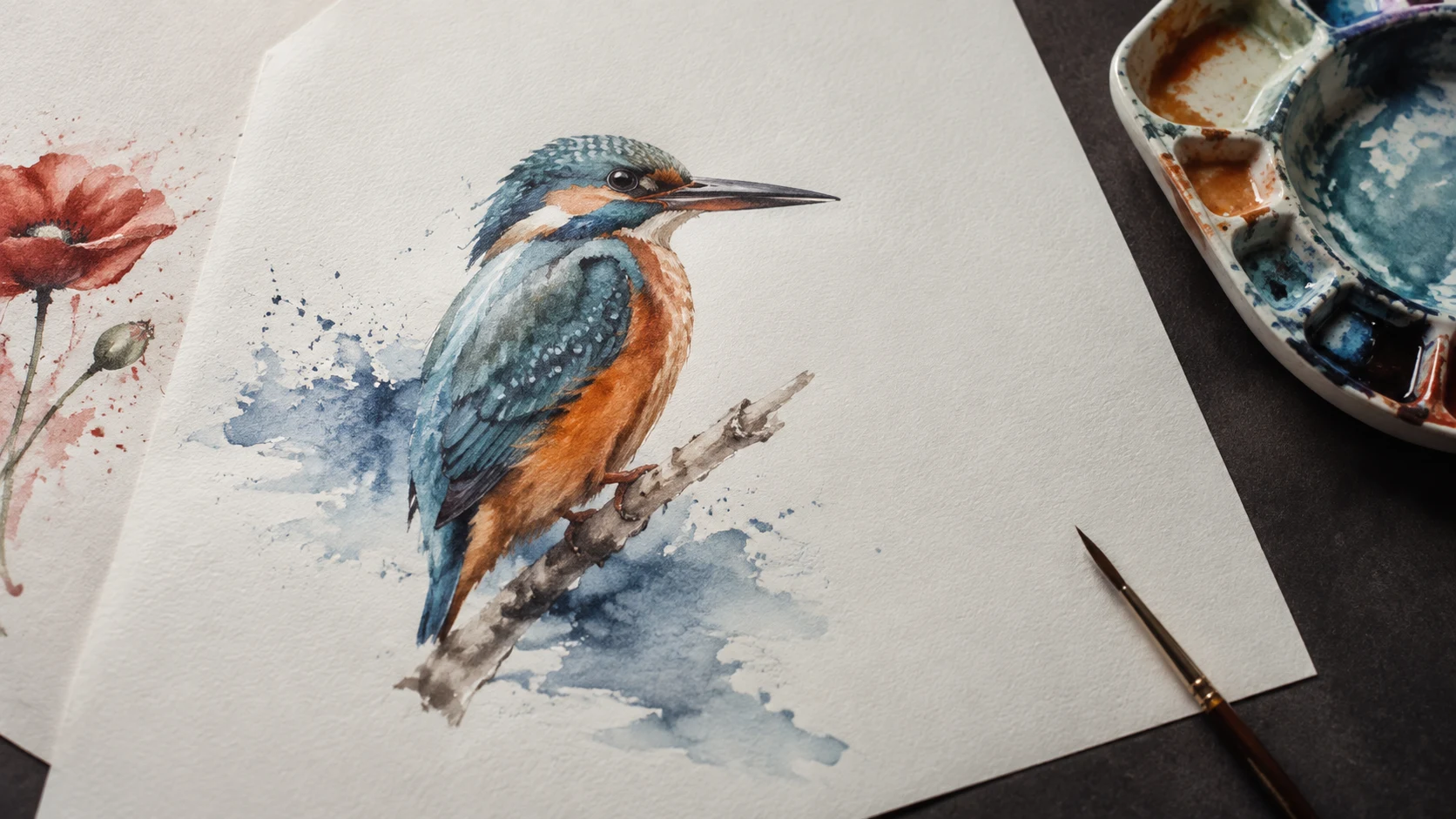
The blue wash is usually what catches your eye. In a kingfisher design, it can trail off the wing like wet paint, leaving the orange breast almost untouched. Then the image gets shrunk to fit a wrist. The beak, wing and splash begin to crowd each other.
A bright close-up can hide the decisions that matter at actual size. Check the edges that define your watercolor tattoo, the space around the wash and the artist's healed work while the design is still on paper.
The images here were generated with AI to illustrate design choices. They show invented paper studies and a paper-placement scene, not tattoo results or evidence of how ink ages.
The marks in a watercolor tattoo
Soft washes, broken color edges and visible brush-like marks give this style its painted appearance. The subject can be quite solid underneath them. A bird may have a sharply defined head while its tail dissolves into an abstract splash.
That connection to painting has a documented history. MCA Denver's 2019 Amanda Wachob exhibition describes her use of brushstrokes, washes and splatters in tattooing from 2008.
When collecting watercolor tattoo ideas, save the particular treatment you like. A loose blue background behind a black bird and a bird built entirely from blue shapes give an artist different instructions. “Watercolor kingfisher” leaves that choice open.
Outlines change the drawing
In the poppy studies below, the left version uses a dark line around selected petals. The right uses red shapes, a dark center and gaps of untouched paper to separate the petals. Both have a recognizable flower; they arrive there through different marks.
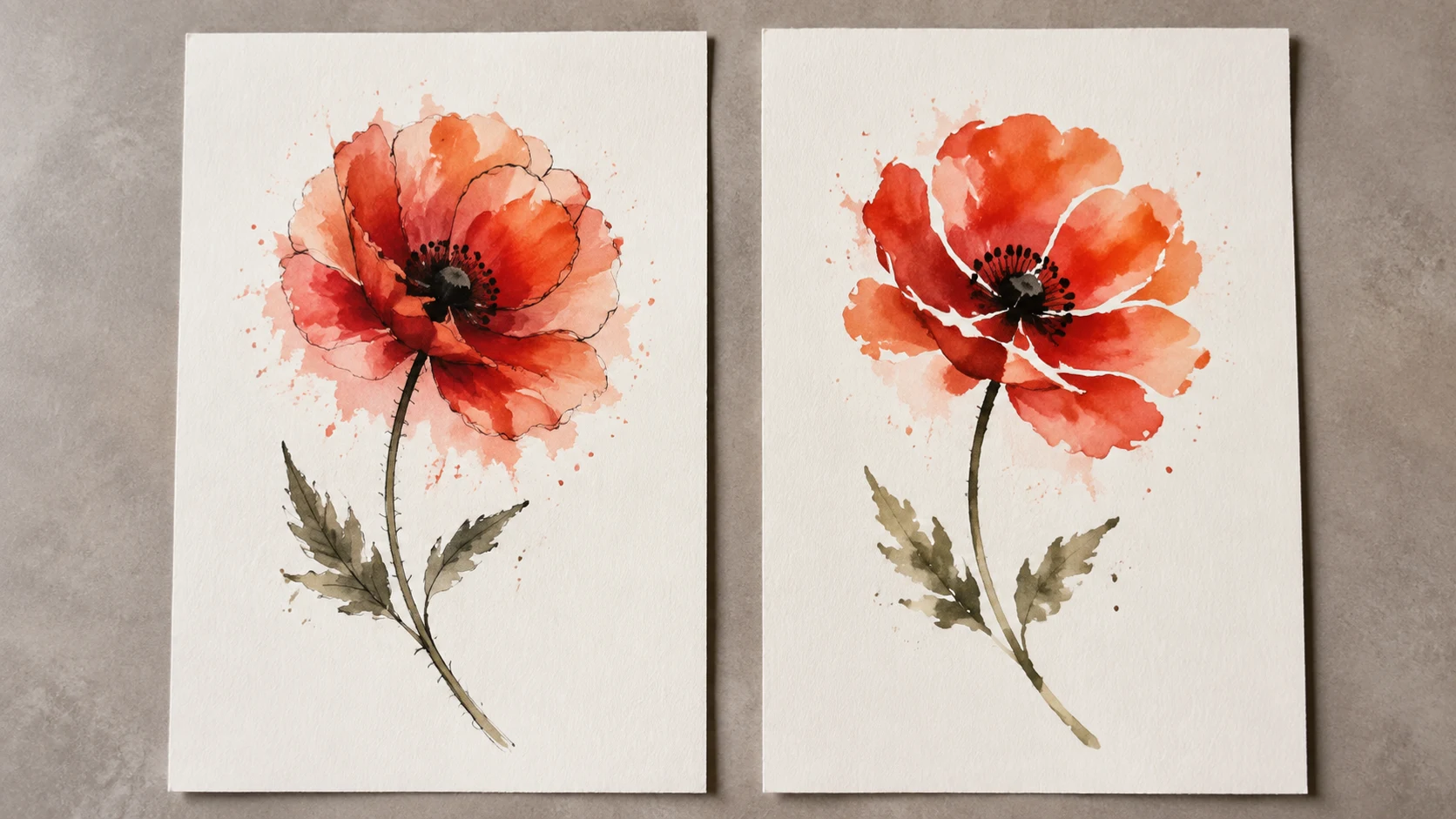
Look at the flower without zooming in. In the outlined version, notice how much attention the line takes away from the wash. In the color-led version, follow the edge of each petal. If two petals disappear into the same red patch, ask the artist to adjust their separation before adding more detail.
A dark outline can make a drawing easier to read. Its presence alone tells you little about how that particular tattoo will look years later. Treat the outline choice as part of the composition, and assess aging through actual work from the artist.
Fading needs dated photographs
A fresh, closely cropped portfolio photo shows the design at one moment. Ask to see healed pieces, then older examples with an approximate tattoo date and any touch-ups noted. “Healed” can describe a much shorter interval than the years you have in mind.
For a useful comparison, look for similar colors, scale and placement, preferably on skin tones close to yours. Check whether the photo was taken in comparable light. A saturated studio shot and a dim phone picture are a poor basis for judging color loss.
You may find older work you still love, or decide you prefer a stronger silhouette. Neither outcome supplies a fixed lifespan for the style. Sun exposure is one relevant factor: the American Academy of Dermatology notes that UV can fade some tattoo inks. Plan sun protection for healed skin; follow your artist's separate instructions while a new tattoo heals.
Try the whole wash at actual size
Include the outermost color marks when measuring. A flower head may fit on a forearm while its sideways splash wraps out of view.
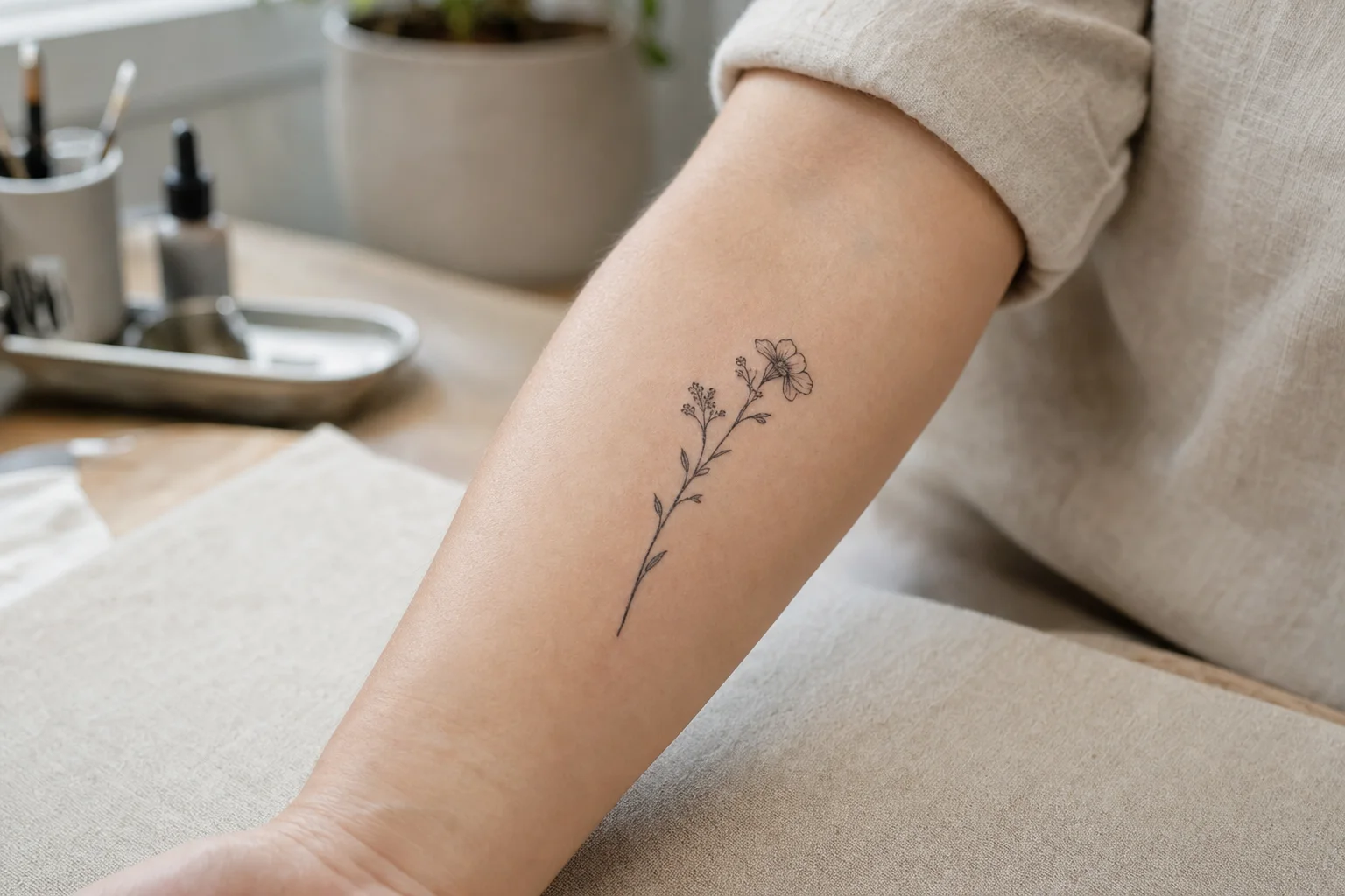
Print the complete concept at two possible sizes. A 12 cm and an 18 cm version, for example, give you something tangible to compare; those are trial dimensions, not a minimum-size rule. Lay each paper version along a relaxed forearm, then turn the arm. Watch where the stem lands and where the broadest petals disappear around the side. The artist will refine placement with a stencil.
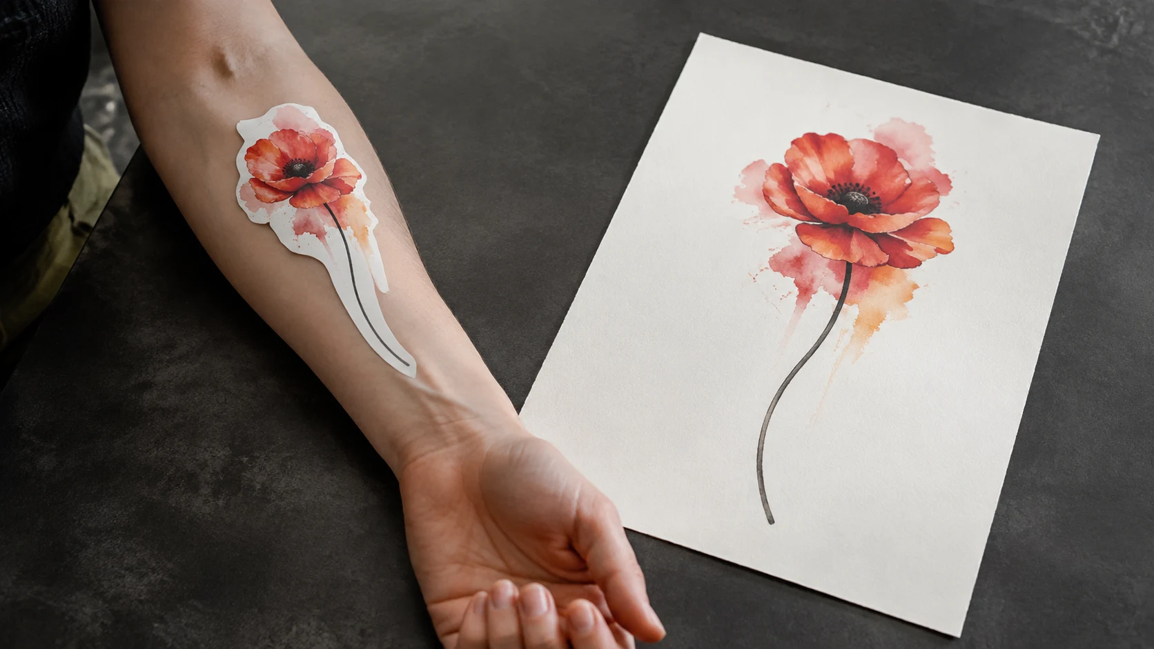
If the small version loses the gaps between petals, discuss fewer petals or a larger flower. If width is the problem, compare the available space on the upper arm or thigh before squeezing the wash. Our tattoo placement guide gives you more ways to think about the body area.
Bring a reference the artist can respond to
Baris Yesilbas's consultation FAQ asks for the subject, size, placement and amount of detail, along with references. That is a useful level of specificity for the first message.
You can explore a rough direction in the OpenInk tattoo generator with a prompt such as:
Single red-orange poppy for a forearm, long curved stem, dark center, clearly separated petals, restrained watercolor wash around the flower, open space below it. Plain background.
Save a concept that helps explain your preference. Add the approximate height in your message to the artist; a generated image does not establish physical dimensions or predict healed color. Let the artist redraw it for your skin, their technique and the available space.
Before sending the reference, look at it once more at the size you intend to wear. You should be able to point to the flower's shape without having to enlarge the image.
Turn this guide into a tattoo draft
Keep the motif from this article, then test style, placement, and line weight before you talk with an artist.