Dotwork Tattoo Guide: Stippling, Density, and Why the Dots Outlast the Line
Dotwork builds everything from one mark repeated: tone, shadow, a whole mandala out of nothing but points. The dots matter, but the empty skin between them is doing just as much of the drawing. It asks for patience at the machine and restraint in the design, and it punishes anyone who rushes either one.
A strong dotwork piece holds soft gradients that still snap into a clear shape from across the room.
What Dotwork Means Now
Dotwork tattooing builds an image out of individual points instead of solid fill or unbroken line. Tattoodo's dotwork style guide frames it as work where tone, shadow, and texture all come from the density and spacing of dots, not from shading passes. That sounds narrow until you see how far the style stretches across lanes:
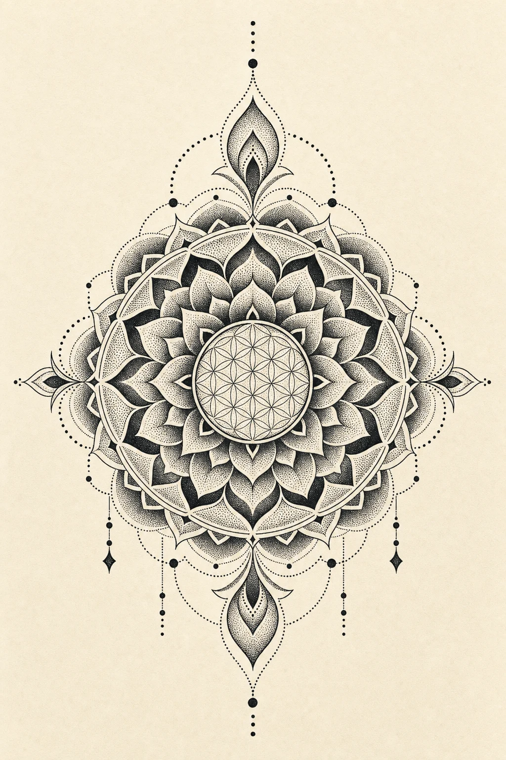
- Sacred-geometry and mandala dotwork: radial grids and rings where stippling carries the gradient between bands
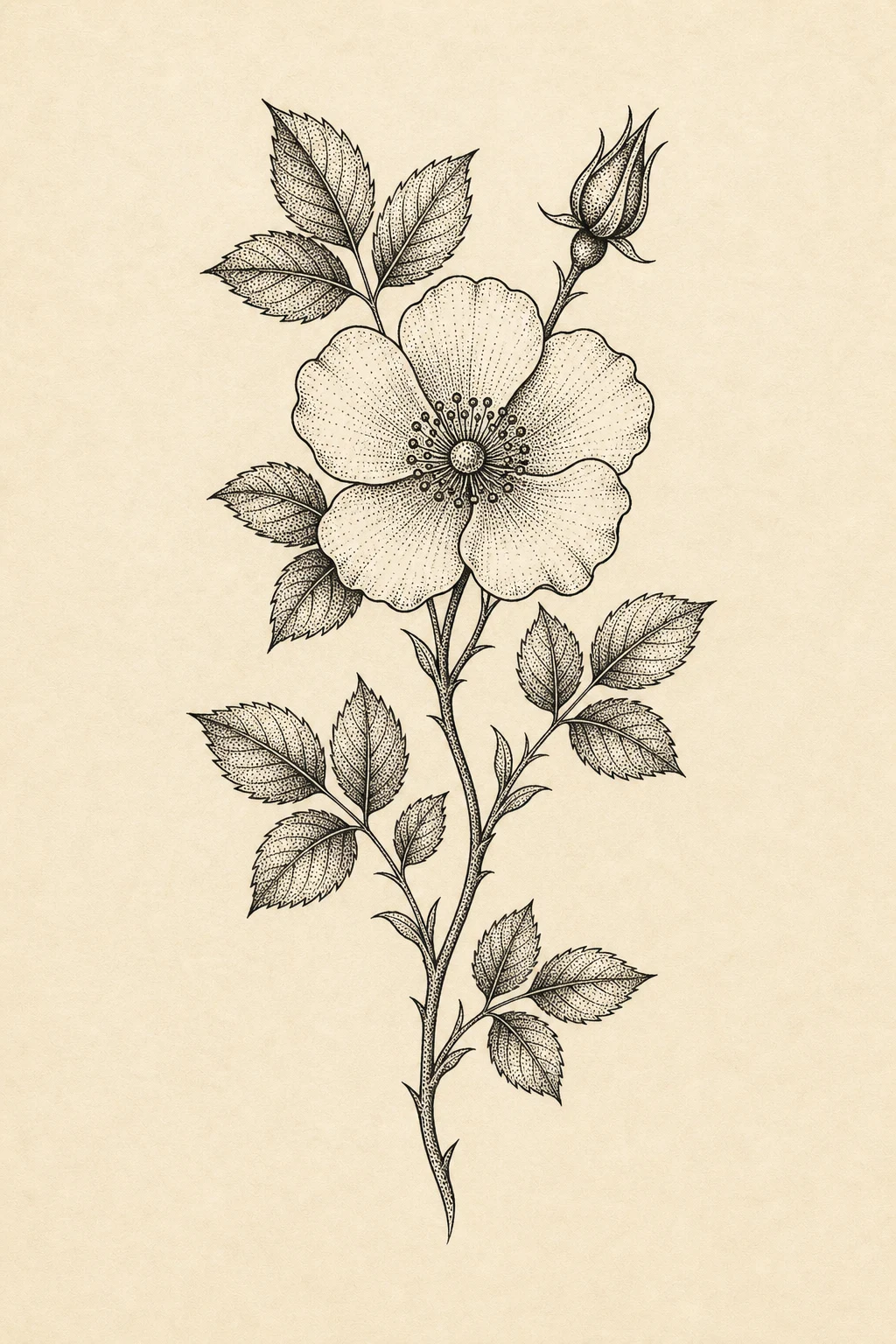
- Botanical stippling: leaves, petals, and stems shaped by dot fields instead of solid black
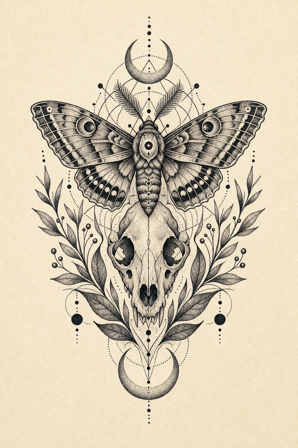
- Celestial and occult dotwork: moons, stars, eyes, and ritual marks where soft fades suit the mood
- Animal and skull dot-shading: illustrative subjects rendered in stipple, where the silhouette carries the read
The sacred-geometry lane overlaps hardest with mandala work, and it carries the most history of the four.
Density Is The Whole Craft
Dotwork lives or dies on three variables: dot size, needle depth, and the spacing between marks. Tonal control comes from these. So does whether the piece still reads after a year in skin.
Dot size sets your range: fine dots for delicate gradients, larger ones for graphic weight. Needle depth decides how the ink settles and heals; too shallow and the dot fades, too deep and it spreads. Spacing is the variable people underrate, because it does the actual shading. Tight clusters go dark; leave the gaps open and the area lifts toward the skin tone, and the slow build between those two extremes is where tone lives.
A round liner gives you crisp, separated dots for tight gradients and clean detail. A magnum lays down softer, broader fields faster when you want a wash of tone rather than countable points. The trap sits in the middle, in the muddy middle-gray patch, where dots packed neither tight nor open settle into a flat, characterless smudge that says nothing. Strong dotwork keeps its lights light and its darks dark, with intention in between.
Use the squint test. Back away from the design until the single dots disappear. If the shape and its gradient still read clean, the density plan works. If it collapses into one flat tone, you need to rethink the spacing before anyone picks up a machine.
A Short, Honest Word On Where Dotwork Comes From
Pointillism shaped the way the West reads dotwork, but it did not invent the idea of building an image from points on skin.
Seurat and Signac built paintings from small dabs of color that the eye blends at distance, the same optical logic a stippled gradient runs on (Britannica's entry on Pointillism walks through it). So our visual shorthand borrows from the painters, but the act of stippling skin was never theirs to invent. Tap and point tattooing runs deep in Polynesian and Samoan traditions, and Thai and Khmer sak yant, the geometric yantra applied and blessed by monks and Ajarn (see Wikipedia's entry on Yantra tattooing), long predate any French canvas. In the 1990s Xed LeHead, the artist many call "the Dotfather," reintroduced hand-poked dotwork and sacred geometry to Western tattooing and turned it into a recognizable contemporary style.
The optical trick is Seurat's. The marks on skin are far older than any French canvas, and they got there by a completely separate road.
Motifs That Belong In Dotwork
Mandalas and sacred-geometry grids are the obvious home for dotwork, since radial repetition is exactly what stippling wants, with the gradient doing the breathing between rings. The subjects that work all hand the artist something to organize around, a strong silhouette or a clear central axis. Botanical stippling works when the leaf or petal already has a clean edge, so the dots fill a shape instead of inventing one. Celestial and occult pieces suit the soft fade of a dot field, where a hard line would feel wrong. Animal and skull dot-shading reads only when the silhouette is honest first; a stippled skull lives or dies on its outline, and no amount of texture rescues a weak one. Lock the shape down before you commit a single dot to it.
Our dotwork tattoo ideas page collects pieces across all four lanes.
The best subjects for dotwork usually share these traits:
- A readable silhouette or a clear central axis
- Room to space the dots rather than cram them
- Tone that earns the hours of patient stippling
- A reason for every dark pocket, not shadow added to fill space
Placement Changes How The Dots Survive
Put the same dot field on a forearm and on a finger and you get two different lifespans. Forearms, outer arms, thighs, calves, backs, and sternums all hold stippling well, because they give you flatter planes, steadier skin, and room to scale, and a year-old dot field there still reads as a gradient instead of a haze. Fingers, palms, and feet are the opposite. High skin turnover blurs stippling fast, and a delicate dot gradient can soften into a smear within months. The piece needs open skin to survive, and those spots do not give it any.
Scale is the quiet rule under all of it. A stippled mandala that breathes at palm size on a thigh turns to mud at coin size on a wrist, so size the dot field to the body part rather than copying the proportions off a reference photo.
Aging, Healing, And Why Spacing Wins
Ink spreads as it settles, and dotwork ages around that one fact. The artists who plan for it build the longevity in from the first dot, leaning on intentional spacing and black anchors where a dense gray field would simply fall apart. A field stippled tight and even has nowhere to spread but into itself, and five years on it can flatten into one gray smudge with no gradient left. Leave open skin between the dots and drop in a few solid black anchors, and the contrast survives the migration even as everything softens a little. The muddy middle-gray patch is the enemy here too. Build real contrast instead of trusting a wash of medium tone to carry the piece.
Follow your artist's healing instructions to the letter while the dots settle. The basics, per the Cleveland Clinic's tattoo aftercare guidance, come down to gentle washing, moisturizing, and leaving the piece alone. UV light fades tattoo ink over time, which is why the American Academy of Dermatology pushes sunscreen and shade for healed work, and fine stipple gives that fading nowhere to hide.
One practical thing to ask an artist for: a healed dotwork piece at a year out, not a fresh one, since fresh stipple always looks crisp.
Where Dotwork Goes Wrong
Most dotwork disasters trace back to the same handful of decisions:
- Dots drawn too fine and too close, so they merge into a flat gray instead of a gradient
- No silhouette under the texture, so the stippling has nothing to describe
- A flat smudge with no contrast, no real lights, no real darks
- Bad placement on fingers or feet, where turnover blurs the work fast
- Rushing a piece that genuinely needs hours of patient stippling
Dotwork is slow and unforgiving, and it shows immediately when someone treats it as whip-shading shorthand. The artists worth booking stipple regularly and have a healed portfolio to prove it, not just a dot field they reach for when a deadline is tight. There is also a real hand-poke versus rotary tradeoff. Hand-poked dotwork tends to mean gentler trauma and, for a lot of people, cleaner healing, while a machine moves faster across a large field. Neither one wins outright; it comes down to the piece, the skin, and the hand holding the needle.
Designing A Dotwork Tattoo With OpenInk
Dotwork is one of the best styles to test in an AI generator, because you can map a density plan before the needle ever touches skin. You get to see where it should go dense, where it should fade, and where the skin stays open, all the decisions that turn expensive once they have healed in. A quick draft in the OpenInk generator lets you read the gradient before you commit hours to it.
Start with a prompt like this:
"Sacred-geometry mandala dotwork tattoo for the inner forearm, stippled tonal gradient, dense dot pockets fading softly into open skin, clear space left between the rings, a few solid black anchors for contrast, no solid line outline, no micro-text, readable from across the room, tattoo flash style, spaced for clean healing."
Then push the draft one direction at a time:
- A denser core
- A softer fade at the edges
- More open skin between the rings
- A black anchor instead of pure stipple
- Placement preview, forearm versus sternum
For prompt structure, pair this with our ChatGPT Images 2.0 tattoo prompt guide, and browse the dotwork tattoo ideas gallery for a feel for what holds up. When the direction is clear, bring it into the OpenInk AI tattoo generator and test dotwork as a density system, with dot size, spacing, fade, and anchors all working together.
Dotwork is the slow style. Every dot is a decision, and the patient ones outlast the line.
Related Dotwork And Sacred-Geometry Guides
- Geometric Tattoo Guide — the sacred-geometry hub, where mandala dotwork and clean linework overlap
- Blackwork Tattoo Guide — how black anchors, negative space, and contrast do the real drawing
Turn this guide into a tattoo draft
Keep the motif from this article, then test style, placement, and line weight before you talk with an artist.