Koi Fish Tattoo Meaning: Direction, Color, and Water
The koi is probably the single most requested Japanese tattoo motif. And honestly? Most people stop at "it means perseverance" and call it a day.
That's fine. But if you're going to wear this on your body forever, you might want to know what you're actually saying — because every design choice in a koi tattoo carries specific weight, and some combinations say things you might not intend.
The Dragon Gate Legend, and Why It Sticks
The core story is simple: koi swim upstream. The strongest ones reach a mythical waterfall called the Dragon Gate, and any koi that leaps over it transforms into a dragon. It's a Chinese legend — originating from tales about the Yellow River's rapids at Longmen — that Japan adopted and made central to its tattoo tradition.
The story has lasted centuries because of what it emphasizes: the journey, not the destination. The koi is celebrated for fighting the current, not for becoming a dragon. In the original telling, hundreds of koi attempt the climb, and most fail. The story honors every fish that tries, not just the one that transforms. That distinction matters when you're choosing how to depict yours.
There's also a lesser-known layer: in some versions, the koi that fails the leap but keeps trying is considered more admirable than the one that succeeds and rests. The struggle itself is the point.
Why Color Is Vocabulary, Not Decoration
In a lot of Western tattoo culture, you pick colors because they look good. Japanese tattooing treats color as vocabulary:
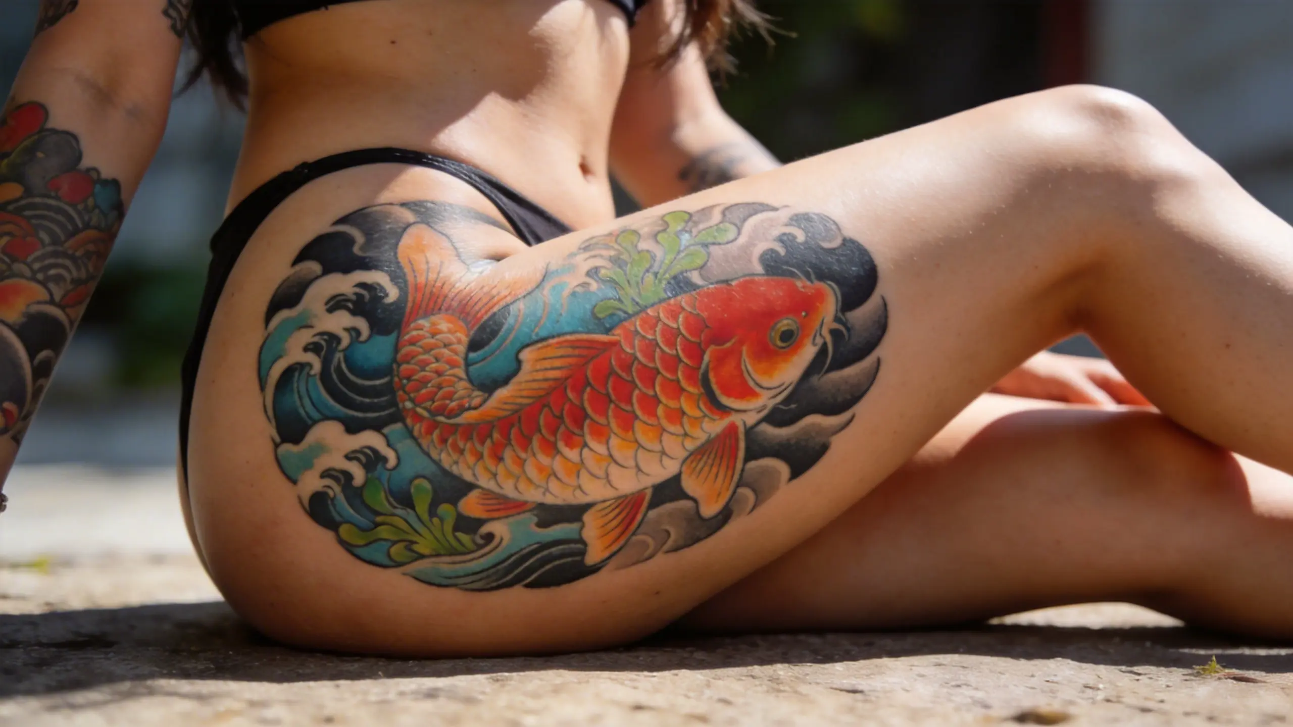
Red koi carry themes of love and raw energy. They're bold, unapologetic. If you've ever seen a full red koi sleeve in person, you know it commands attention in a way that's almost aggressive. Red is also associated with maternal love and bravery — making it a popular choice for pieces honoring family.
Black koi are about triumph over adversity. Specifically, adversity you've already beaten. There's a heaviness to a black koi that a red one doesn't have — it's earned, not aspirational. Black koi are traditionally linked to the father figure and to overcoming life's hardest obstacles.
Blue koi lean toward calm strength and masculinity in the traditional canon. They're the most understated of the three, and honestly the least common in full Japanese work. Blue works well when you want quiet resilience without the intensity of red or the gravity of black.
Gold and yellow koi carry associations with prosperity and good fortune. They show up more in standalone pieces than in full traditional compositions, and they pair especially well with flowing water and maple leaves rather than crashing waves.
Swimming Up vs. Swimming Down — This Is the Part People Get Wrong
Here's where it gets specific:
A koi swimming upstream means you're in the fight. You're still climbing, still pushing. It's the most popular choice, and for good reason — it captures that aspirational energy most people connect with. Placement matters here: an upward koi works well on the upper arm, outer forearm, or back where the visual direction follows your body's upward lines. On the calf, an upward koi can look like it's swimming toward your knee, which creates a strong visual pull.
A koi swimming downstream doesn't mean you gave up. It means you've already made it over the gate. Goals achieved. Some people read this as "defeated," which is a misunderstanding of the tradition — it's actually a statement of quiet confidence. A downward koi works beautifully on the outer arm or ribs, where gravity gives it a sense of natural movement. It's the choice for someone who's already proven something and doesn't need to announce it.
The direction also affects composition. An upward koi pairs naturally with crashing waves and turbulent water. A downward koi works better with calmer currents and scattered cherry blossoms. Mixing these — say, an upward koi in calm water — creates a visual tension that can feel unintentional if you don't plan for it.
Water Makes or Breaks the Piece
A koi without water is like a samurai without armor — technically possible, but you're losing half the story. The water in a koi composition isn't background; it's context.
Rough, churning waves amplify struggle and effort. Smooth, flowing water suggests peace and resolution. And the transition between them — turbulent at the bottom, calm at the top — can tell an entire life story in one piece.
The style of water matters too. Traditional Japanese water (wave patterns with sharp crests and circular eddies) gives the piece an unmistakably Irezumi feel. Ink-wash style water feels more painterly and artistic. Realistic water with spray and foam adds a modern edge. The water style you choose sets the emotional tone for the entire tattoo, so treat it as a deliberate decision, not an afterthought.
Common Mistakes to Avoid
A few things that trip people up when designing koi tattoos:
Ignoring scale and proportion. A koi crammed into too small a space loses the sense of movement that makes the motif powerful. Koi are large-format subjects — they need room to breathe. If you want something small, consider whether a different motif might serve you better.
Random color choices. Picking a color purely for aesthetics without understanding its traditional meaning can create a disconnect, especially if you later add more Japanese elements to the piece. It's worth knowing the vocabulary even if you decide to break the rules.
Forgetting the background. A koi floating in empty skin looks unfinished in the Japanese tradition. Even minimal water elements — a few wave lines, some spray — anchor the composition and give the fish context.
Conflicting direction and mood. An upstream koi in perfectly calm water, or a downstream koi in violent waves, sends mixed signals. These combinations can work if they're intentional, but they require a thoughtful composition to pull off.
Designing Your Koi with OpenInk
If you want to explore what your koi piece could look like, try being specific with your prompt. Something like:
"Red Japanese koi swimming upward through turbulent ink-wash waves, cherry blossom petals caught in the spray, traditional Irezumi composition, full sleeve format"
The more compositional intent you give the AI, the better the result. Try specifying not just the fish, but the water style, background elements, and even the body placement you're considering. You can also fine-tune scale details in InkCanvas — things like how defined the individual scales are, how much spray the water kicks up, or how much negative space surrounds the fish.
Turn this guide into a tattoo draft
Keep the motif from this article, then test style, placement, and line weight before you talk with an artist.